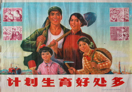
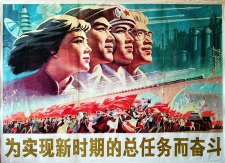
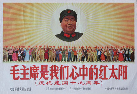
To reach the right look and feel for the newspaper, a little more research is in order. We’re aiming at a design that says ‘This newspaper is state owned, used for propaganda purposes only, yet looks to draw in the reader through it’s trustworthy appearance and bleeding edge news straight from the streets of Elastic Versailles’. In order to achieve this, we should learn from propaganda with a similar aim: gaining trust and being completely transparent about what this trust is needed for (getting people to visit Elastic Versailles). We have isolated 3 strategies:
Strategy 1: gaining trust by promising good times = blue skies and happy people
Strategy 2: gaining trust by showing determination and a sense of purpose = people looking sternly into one direction
Strategy 3: gaining trust by showing strenght, power and energy = rays!
Incorporating all 3 strategies into the design should give us the best results. The research has been done, now it is up to the designers.
Tags: design, newspaper, propaganda


[…] and feel has been based on the small research on state controlled newspapers and blogs, as well as propaganda poster strategies. The later led to repurpose and adapt more than 60, mostly republic of china’s, slogans that […]